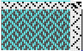
I have a really bad habit of collecting drafts I see on the internet and saving them in my weaving folder on the computer with the hopes of trying them out some day. This draft is one of them. I just did a quick search on the internet and I think I originally found the draft on Pinterest. Upon 'visiting the page' the link just takes me back to a Google search so I have no idea who first posted the draft out there in cyber space. Thank you to who ever did that!
I used a pale turquoise for the warp and a dark grey for the weft. Both yarns are 8/2 Orlec, which is an acrylic. 160 ends at 20 epi gave it a decent width and I wove to about 78 inches in length.
For the last few times I have wound out a warp I have done a double crossed warp. I combined a couple of different warping techniques from a couple of different sources and it has worked out so far - well, except this time.
Ashford looms has put out a great video on winding a warp using 2 crosses. One end of your warp is crossed at every thread and is used for threading your heddles. The other cross, at the other end of the warp, is crossed at the same intervals as your ends per inch. So, if you have 20 ends per inch you only cross your warp every 20 passes of the yarn. You end up with small crossed bunches of yarn that are in inch's worth of ends. This makes for easy counting and making sure you have the correct number of ends and for tensioning the warp as it is wound onto the loom. Joyce, a member of some weaving Facebook groups, posted a method of using dowels which are interlaced in the warp, to add tension as you are winding onto the loom. It is a similar method that utilizes Angel Wings. I interlace four dowels through the 'inch' intervals, tie the dowels together, and then as I wind on, the yarn is pulled through these dowels. I do the standard 'tug and pull' once in a while and make sure that all the threads are getting the same amount of tension. It is a much nicer system to work with instead of tying on weights at the one end of the warp.
This time, however, I somehow managed to twist the crosses as I passed the looped end onto the back beam. I always warp btf and use a raddle to space out my warp so I don't know how I managed to do that. As I got closer to the end of the warp in weaving I was worried that the twist would give me an uneven tension in the warp but it didn't affect it too much and I managed to keep an even fell line.
So here is the draft but since I can't remember where I got it from I have done it up in Fiberworks and just printed out the image....it is a simple 8 thread repeat on the warp and a 12 pick repeat for treadling. I used my Rasmussen table loom and the treadling is nice that you are only changing one lever for each pick - made it easy to catch any treadling errors. Once I went through the repeat a couple of times I more or less had it memorized and just kept a copy of the sequence handy to have a peek at once in a while.
When ever I do some weaving I tend to put the draft into Fiberworks and then copy different parts of the image - for example, using the snipping tool I would just select one repeat of the threading sequence, enlarge it, print it out and then use that as my guide for when I am actually threading the heddles. I find that breaking up the draft makes it easier for me to read and to keep track of where I am. Same goes for the tie-up and the treadling.
While I was weaving this scarf I didn't pound the weft into place and I could really see the difference in my beat as I progressed. I guess the way the colours intermingled really contributed to showing that. Once I washed and dried the scarf most of that colour distortion did disappear but you can still see some slight variations. It doesn't seem to be too garish or distract from the scarf so I am happy the way it turned out. My selvedges are good and I only had to load my shuttle once so there was only one place I had to tuck in an end....overall pretty satisfied with it.
And the final product....
My camera on my tablet does not do the colour justice. The actual colour is way closer to the print of the draft then what you can see above.
You can see a faint difference in the colour tone on the right side - that is where there was a difference in the beat.
Front and back views - again you can see where I beat just a little bit harder. The boxes are a little more condensed. I don't think a non-weaver would really notice the difference though.
Finally, I just have to figure out how to take some "artistic" pictures!


Nice scarf! :)
ReplyDeleteThanks Jane!!
DeleteBeautiful work! That draft is very interesting, thanks for sharing.
ReplyDeleteThanks for visiting and commenting!!
Delete